(“Evaluate” is the final Dance Step in Van Matre’s book Interpretive Desgin and the Dance of Experience. It is important because we need some way of knowing if the experiences designed are achieving what they were designed to do. Nathan Taxel attended the EID webinar on a survey tool developed by our colleague Lars Wohlers, Visitor Track ‘N Time, and soon after we began a conversation about his passion for evaluation. What follows is how Nathan accomplished an evaluation at the Orange County, California Parks. We think this post is important because experiential evaluations is not the norm in the field of interpretation or environmental educations. Thanks Nathan…)
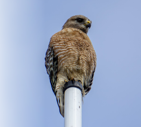
Photo Credit: Nathan Taxel
Since my career in interpretation began in the galleries of the Cleveland Museum of Natural History in the late aughts, I have been deeply curious about measuring the effectiveness of programs, activities, and exhibits.
And like many of us, that is not where I started. As a teen and young adult my focus was on activism and the undefined intent to turn environmental advocacy into a career. During an environmental education class towards the end of my undergraduate studies I had one of those classic “lightbulb” moments just weeks into the term. I instantly saw that meaningful educational experiences were the most effective way to make changes in the world without compromising my ideals.
In short, influencing behavior and changing attitudes is the main reason I entered the interpretive field in the first place. I also genuinely believe that effective interpretation of our communal history and landscape can play a role in healing the calcified and resentful sense of tribalism which grips much of my country, and the planet, today. I feel compelled to investigate what experiences make interpretation effective or ineffective.
Finding the Right Evaluation Tool
In pursuit of that goal, in 2022, I discovered the work of Dr. Myles Richardson and the Nature Connectedness Research Group (NCRG) at the University of Derby in the United Kingdom (UK). Their aim is “to understand people’s sense of their own relationship with the natural world” and “create everyday interventions in order to improve this relationship for the wellbeing of humans and nature.” In this paradigm Nature Connectedness is “a measurable psychological construct that moves beyond contact with nature to an individual’s sense of their relationship with the natural world.”
Using analytical psychology and quantitative population studies the NCRG has developed a methodology called “Nature Connection Science” which could revolutionize the design and evaluation of interpretive experiences. The field of interpretation has for some time understood the value of making connections between people and important heritage sites. What makes the Nature Connection Science model ground-breaking is that it can be a measurement tool for both large-scale population studies and small-scale evaluations of specific activities and experiences. It is a tool to measure the impact of our programs, activities, exhibits and media in real time.
The lofty goals of helping people and the Earth are accomplished by engaging with the NCRG’s “Five Pathway’s to Nature Connection.” These include the following:
· exploring and experiencing nature through all the senses (Senses),
· seeking and appreciating the beauty of the natural world (Beauty),
· noticing and welcoming the feelings nature inspires (Emotion),
· celebrating and sharing nature’s events and stories (Meaning), and
· caring for nature (Compassion).

The data the research group has gathered from large scale studies in the UK, as well as from dozens of additional studies by independent research groups around the world, indicates “there is clear evidence that contact and engagement with nature can increase nature connectedness, and that engaging in nature connection practices on a regular, daily, or weekly basis can lead to sustained increases in nature connection.”
Getting Started
The evidence the NCRG has gathered and the methodology they developed in the United Kingdom gives us a road map to determining how to effectively execute our missions and goals in a tangible AND measurable way, not to mention improve the quality of life for individuals and communities. Using the NCRG insights and methods plus a pre and post survey, we decided to measure the short term effectiveness of the “Restorative Bird Watching” experience offered by the Orange County (OC) Parks (California) to measure this activity’s impact on participant’s moods and self-identified connection to nature.

Photo Credit: Nathan Taxel
We chose bird watching as our entry point into nature connectedness because it is a very popular activity in the communities OC Parks serves and, more importantly, there is evidence that birds hold a particular space in our collective consciousness and provoke emotional responses in people even when they are not actively observing them.

Photo Credit: Orange County Parks, California
The experience was a 2-hour guided walk held at a remote historic home and garden in rural Orange County, California. The site we chose, Arden: Helena Modjeska Historic House and Gardens, is on the national register of historic places and provides about 200 yards of flat well-groomed trails, manicured Victorian style gardens, shade, plenty of places to sit, a babbling brook, and an abundance of avian life. The setting was ideal for the atmosphere we were trying to create and likely a major contributor to the positive results from the pre and post surveys.
It was advertised as a slow paced and accessible walk which will offer practices to emphasize the positive mental health benefits of bird watching, connecting to nature through guided observation, sharing stories and community building, creativity, and practicing mindfulness. The program was offered once a month, in May, June, July, August, and September of 2023 and a total of 53 members of the public participated in the 5 sessions. The sessions were advertised online through program websites, monthly newsletters, social media (Facebook, X, and Instagram) and added to an event calendar managed by the Mindful Birding Network. Our big picture takeaway from the data was that negative emotions decreased and positive emotions increased after involvement in the experience.

Participant Details

Photo Credit: Nathan Taxel

Photo Credit: Nathan Taxel
After registering for “Restorative Bird Watching” online, participants were notified via email that data would be collected via pre and post program surveys. No details were provided about the survey questions. Upon arrival participants received a 2-sided document which included two different measurement tools. The first was the Positive and Negative Affect Schedule (PANAS) developed by Watson, Clark, and Tellegen in 1988 to measure mood changes. It is widely used in psychological research.
The reverse side of the sheet included an illustrated version of the Inclusion of Nature in Self (INS) Scale which was developed in 2021. The participants received a second copy of the same form at the end of the experience in order to measure any changes in mood or self-identified connection to nature. Our goal was to generate data which would corroborate or conflict with the results of other studies under similar conditions and to see if this experience activated a measurable change in attitude or mood in the participants.
The experience began with an OC Parks staff facilitator introducing the activity with statements of intent, gratitude, and a reading of the poem “Peace of the Wild Things” by Wendell Berry to set the mood. In a circle, everyone shared their “spark bird” – the bird that inspired a person to get more interested in birds and bird watching. The goal was to break the ice and have participants feel more comfortable sharing. Next the facilitator led a guided mindfulness exercise encouraging participants to connect with their surroundings and progressively focus on their body, senses, and the natural community around them.

Nathan Taxel “Spark” Bird; Photo Credit: Nathan Taxel
Participants slowly moved through the space observing birds, guided by prompts designed to inspire curiosity and reflection rather than identification. They explored bird behavior, sounds, and appearance, connecting their observations to personal memories and questions. This transitioned into a silent listening session to explore bird songs, followed by a reflective group discussion. Later, participants engaged in independent mindful observation, recording sensory details before interacting with nature.


Photo Credit: Nathan Taxel
The final exercise involved tracking a single bird, observing its behavior, and sharing insights about its beauty, actions, and needs. Small, organically formed group discussions fostered trust, community, and a deeper connection to both birds and each other. Observing these final interactions between participants reinforced our belief in the power of interpretive activities to build bonds and inspire shared learning.
The program concluded with a closing circle where participants were given a final opportunity to share stories, observations, and reactions to the activities they participated in. Statements of gratitude for the participants, the place, and the birds we observed were offered to end the experience.
Survey Results
The results of our pre and post program show small, but not insignificant, increases in positive emotions (12%) and decreases in negative emotions (18%) on the PANAS scale and a trend toward higher levels of nature connection on the illustrated INS metric. These results corroborate those of the international studies analyzed by the NCRG in their 2022 meta-analysis published in the journal Sustainability entitled “Improving Nature Connectedness in Adults: A Meta-Analysis, Review and Agenda.” By using the principles of nature connectedness to create an interpretive experience, we were able to successfully improve the mood and self-identified nature connectedness of most of our participants. This activity can serve as proof-of-concept for interpretive programs designed specifically to influence attitudes and behavior.


An experience like “Restorative Bird Watching” helps offer participants new techniques for exploring their relationships with nature, provides social validation of their interests, and has the potential to produce an important emotional impact on its participants. By teaching the skills of mindful birdwatching and doing so expressly with the intent of improving mood and mental health, participants are empowered to examine their emotions and connections to the Earth independently. We can all reap the benefits of more time spent outdoors in easily accessible and conventional outdoor settings such as backyards and local parks and by incorporating these mindfulness activities.

Social validation and community building are another reason that group activities like this can have longer term impacts than one might expect from a short-term intervention. The group learning experience validates the interests of the participants and gives them the opportunity to meet like-minded peers. Whether or not those peer connections extend beyond the activity, the impact of spending time in a space with like-minded individuals building care and empathy for the natural world is invaluable and may contribute to extending the benefit beyond the temporal limits.
As I mentioned in the beginning, knowing the effectiveness of our interpretive offerings is key to making a change in our participants and their relationship to the natural world and other heritage sites. Finding the right tool to measure whether your activity is doing the intended job is important. Gathering more information from evaluations and sharing them with others will help all of us in the field determine if interpretive programming is working or not. Further investigation will give us a better understanding of how activities like this can impact our communities and help organizations and agencies achieve their goals.
When despair for the world grows in me
and I wake in the night at the least sound
in fear of what my life and my children’s lives may be,
I go and lie down where the wood drake
rests in his beauty on the water, and the great heron feeds.
I come into the peace of wild things
who do not tax their lives with forethought
of grief. I come into the presence of still water.
And I feel above me the day-blind stars
waiting with their light. For a time
I rest in the grace of the world, and am free.
Copyright (c) 2012 by Wendell Berry

(Nathan Taxel is the Interpretive Programs Curator for OC Parks in Orange County, California, where he oversees the interpretive program for a 60,000-acre regional and wilderness park system. He is also an associate faculty member in the Environmental Studies Department at Saddleback College in Mission Viejo, CA and was recently elected to National Association for Interpretation's Board of Directors. He earned a master’s degree in Parks and Natural Resource Management and a bachelor’s degree in Political Science and Environmental Studies. Nathan lives in Irvine, Ca with his wife and two small children and is an avid amateur photographer and bird watcher. If you would like a more information on the survey questions and results please contact Nathan at nathan.taxel@ocparks.com/ 657-322-3680.